
Ce site utilise des cookies pour améliorer uniquement votre expérience utilisateur.
Vous pouvez lire à tout moment comment nous utilisons les cookies sur le site.

Bonjour, je viens auprès de vous pour limiter la taille de ma page d'accueil.
J'ai essayé quelque trucs mais rien ne marche .
@import url('https://fonts.googleapis.com/css?family=Poppins:200,300,400,500,600,700,800,900&display=swap');
*
{
	margin: 0;
	padding: 0;
	box-sizing: border-box;
	font-family: 'Poppins', sans-serif;
}
header
{
	position: absolute;
	top: 0;
	left: 0;
	width: 100%;
	display: flex;
	justify-content: space-between;
	padding: 40px 100px;
	z-index: 10000;
	transition: 0.6s;
}
body
{
	height: 100%;
}


header .logo
{
	position: relative;
	font-weight: 700;
	color: blue;
	text-decoration: none;
	font-size: 2em;
	letter-spacing: 2px;
	transition: 0.6s;
}
header #togle
{
	position: relative;
	width: 30px;
	height: 30px;
	color:#000;
	cursor: pointer;
}
/* La construction du menu ouverture */
header #togle:before
{
	content: '';
	position: absolute;
	top: 7px;
	width: 100%;
	height: 2px;
	background: blue;
}


header #togle:after
{
	content: '';
	position: absolute;
	bottom: 7px;/*La difference avec le before*/
	width: 100%;
	height: 2px;
	background: blue;
}


/* La construction du menu ouverture liason avec JAVASCRIPT*/


/* La construction du menu fermeture*/
.banner.active header #togle:before
{
	top: 50%;
	left: 50%;
	transform: translate(-50%, -50%) rotate(45deg);
}
.banner.active header #togle:after
{
	top: 50%;
	left: 50%;
	transform: translate(-50%, -50%) rotate(-45deg);
}


/* La construction du menu fermeture liason avec JAVASCRIPT */
.banner
{
	position: relative;
	width: 100%;
	height: 100vh;
	padding: 100px;
	background: url(jokerr.jpg);
	background-size: cover;
	display: flex;
	align-items: center;
	justify-content: left;
	transition: 0.5s;/*Deplacement fluide*/
	z-index: 2;/*Lier avec #navigation*/


}


/*Ouverture reel du menu*/
.banner.active
{
	transform: translateX(-400px);
}
/* Navigation */
#navigation
{
	position:relative;
	bottom: 657px;
	right: -545px; /*Auparavant on avait right: 0*/;
	width: 802px;
	height: 100vh;
	background: #40c3ff;
	z-index: 1;
	display: flex;
	place-items: center;
	transition: 0.5s;


}
#navigation img
{
	position:relative;
	left: 440px;
	bottom: 200px;
	border-radius: 50%;


}
/*Lier avec java + le contenu du menu*/
#navigation.active
{
  right: 0;
}


#navigation ul
{
	position: relative;
	display: flex;
	flex-direction: column;
	left: 200px;


}


#navigation ul li
{
	list-style: none;
}


#navigation ul li a
{
	color: #000;
	text-decoration: none;
	display: inline-block;
	font-size: 2em;
	font-weight: 600;
	text-transform: uppercase;
}
/* le text*/


.content
{
	max-width: 600px;
}
.content h2
{
	color: #fff;
	font-size: 2.5em;
}
.content h2 span
{
	color: #c56cf0;
	font-size: 1.2em;
}


.content p
{
	font-size: 1.2em;
	font-weight: bold;
	color: #000;
	font-weight: 300;
}


.content a
{
	position: relative;
	display: inline-block;
	margin-top: 20px;
	background: blue;
	border-radius: 12px;
	color: #fff;
	padding: 10px 30px;
	text-decoration: none;
	font-size: 1.2em;
	font-weight: bold;
}
.sci
{
	position: absolute;
	display: flex;
	flex-direction: column;
	right: 100px;
}


.sci li
{
	list-style: none;
}
.sci li a
{
	position: relative;
	display: grid ;
	place-items: center;
	width: 50px;
	height: 50px;
	text-decoration: none;
	border: 2px solid #c56cf0;
	margin: 10px 0 0;
	background: #fff;
}


.sci li a:hover
{
	background: #c56cf0;
}
.sci li a img
{
	max-width: 20px;
	filter: invert(1);
	mix-blend-mode: difference;
}


.container
{
	position: relative;
	bottom: 460px;
	left: 50%;
	transform: translate(-50%, -50%);
	width: 800px;
	padding: 30px;
	background: #fff;
	box-sizing: border-box;
	border-radius: 10px;
	box-shadow: 0 15px 50px rgba(0,0,0,.2);
}
.circle
{
	width: 200px;
	height: 200px;
	background: url(img.jpg) no-repeat center;
	border-radius: 50%;
	float: left;
	shape-outside: circle();
	margin: 60px 30px 30px 0;
}


.container p
{
	margin: 0;
	padding: 0;
	text-align: justify;
	line-height: 22px;
	font-weight: 300;
}


h1
{
	margin: 0 0 20px;
	padding: 0;
	font-size: 30px;


}
#popup
{
	position: fixed;
	top: 40%;
	left: 50%;
	transform: translate(-50%, -50%);
	width: 600px;
	padding: 50px;
	box-shadow: 0 5px 30px rgba(0,0,0,.30);
	background: #fff;
	visibility: hidden;
	opacity: 0;
	transition: 0.5s;
}
/*Pour la close*/


#popup.active
{
	top: 50%;
	visibility: visible;/*C tres important le visisble*/
	opacity: 1;
	transition: 0.5s;
}
/* Cadre Grid*/


.new
{
	position: relative;
	max-width: 80%;
	display: grid;
	grid-template-columns: repeat(auto-fill, minmax(300px, 1fr));
	grid-template-rows: minmax(100px, auto);
	margin: 40px;
	grid-auto-flow: dense;
	grid-gap: 10px;
	bottom: 550px;
	left: 8%;
	padding: 100px;
}


.new .box
{
	background: blue;
	padding: 20px;
	display: grid;
	font-size: 20px;
	place-items: center;
	text-align: center;
	color: #fff;
	transition: 0.5s;
}


.new .box:hover
{
	background: #c56cf0;
}


.new .box img
{
	position: relative;
	max-width: 100px;
	margin-bottom: 10px;
}
/* Titre*/
.titre h1
{
	position: absolute;
	bottom: -550px;
	left: 500px;
	text-align: center;
	margin: auto;
}


/*Footer*/


.footer
{
	background: #162c3b;
	padding: 20px 100px;
	display: flex;
	justify-content: space-between;
	align-items: center;
	right:250px;
	width: 1350px;
	text-align: center;
	position: relative;
}


.footer ul
{
	display: flex;
	justify-content: center;
	align-items: center;
	color: #fff;
}


.footer p
{
	color: #fff;
}
.footer ul li
{
	list-style: none;
}


.footer ul li a
{
	text-decoration: none;
	display: inline-block;
	margin: 0 10px;
}


.footer ul li a
{
	text-decoration: none;
	display: inline-block;
	margin: 0 10px;
}


.footer ul li a img
{
	filter: invert(1);
	max-width: 20px;
}
html, body
{
height: 100%;
}
ou bien :
body
{
height: 100%;
}
voir image :
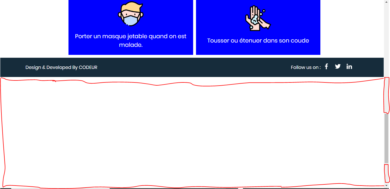
Merci @Jerem971 @sebastien et toute l’équipe du Sitedudev j'ai finalement réglé mon problème en supprimant ce style.
NB: Le bottom -550px était à l'origine de cette espace blanche. Merci à tous
.titre h1
{
	position: absolute;
	bottom: -550px;
	left: 500px;
	text-align: center;
	margin: auto;
}
Re:
Nous sommes ravis d'apprendre que ton problème est résolu 😉
Tu peux maintenant cliquer sur le bouton 
A bientôt 😉
Merci @Jerem971 @sebastien et toute l’équipe du Sitedudev j'ai finalement réglé mon problème en supprimant ce style.
NB: Le bottom -550px était à l'origine de cette espace blanche. Merci à tous
.titre h1
{
	position: absolute;
	bottom: -550px;
	left: 500px;
	text-align: center;
	margin: auto;
}
Re:
Tu peux facilement voir le problème en inspectant l'élément avec l'inspecteur d'éléments 😉
Pour cela, il te suffit d'appuyer sur F12 et de cliquer sur la petite flèche à gauche, de ce fait quand tu passeras le curseur de la souris sur l'espace en blanc, tu cliqueras dessus pour voir l'élément dans ton code qui pose problème 😉
Vérifie également dans l'onglet "Console" que tu n'es pas des erreurs...
@Jerem971 le problème n'est pas résolu . Le problème de la page blanche se trouve on niveau de la body mais pas celle du footer
J'aimerai savoir quel bout de code me permettra de le diminuer . Merci
Re:
Très bien ! 😁
On n'attends que toi 😉
@Jerem971 je vais voir donc
Re:
Très bien 😉
C'est ton pied de page qui pose problème...
Regarde le lien que je t'ai donné, cela devrait résoudre ton problème 😉
@Jerem971 je travaille en local
Re:
Tu travailles directement en local sur ta machine ou en ligne sur ton hébergeur ? 🤔
@Jerem971 je ne pense pas . Meme sans le footer l'espace blanche s'affiche bien .

Ce site utilise des cookies pour améliorer uniquement votre expérience utilisateur.
Vous pouvez lire à tout moment comment nous utilisons les cookies sur le site.