
Ce site utilise des cookies pour améliorer uniquement votre expérience utilisateur.
Vous pouvez lire à tout moment comment nous utilisons les cookies sur le site.

Salut mes camarades. Je viens auprès de vous pour demander de l'aide.
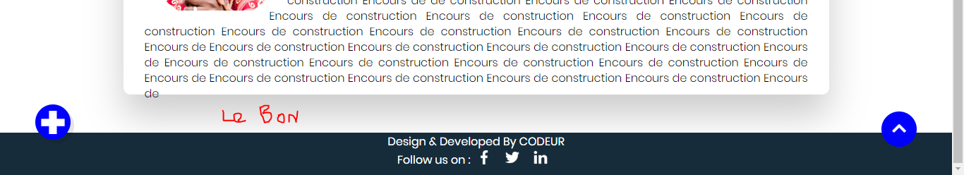
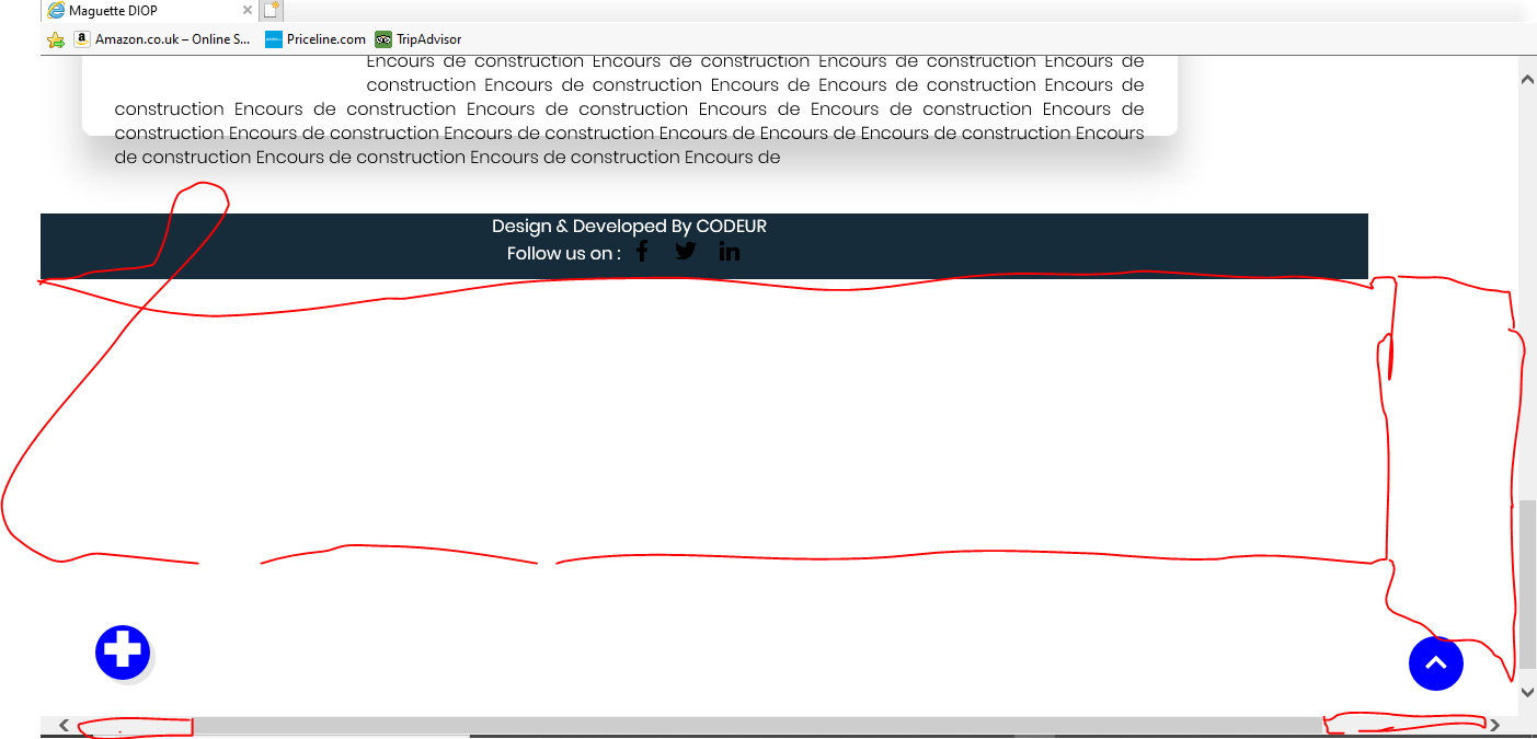
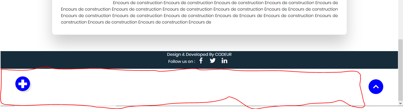
Voilà le constat est là mon site s'affiche très bien sous Chrome.
Mais l'affichage est anormal sous Firefox et Internet Explorer.
J'aimerais savoir comment résoudre ce genre de problème. Voir mes images et code.
@import url('https://fonts.googleapis.com/css?family=Poppins:200,300,400,500,600,700,800,900&display=swap');
@import "http://code.ionicframework.com/ionicons/2.0.1/css/ionicons.min.css";


*
{
	margin: 0;
	padding: 0;
	box-sizing: border-box;
	font-family: 'Poppins', sans-serif;
}
/*top button*/
html
{
	scroll-behavior: smooth; /*Balise tres important ca glisse jusqu'a atteindre le haut*/
}


body
{
	display: block;
	height: 60px;
}


header
{
	position: absolute;
	top: 0;
	left: 0;
	width: 100%;
	display: flex;
	justify-content: space-between;
	padding: 40px 100px;
	z-index: 10000;
	transition: 0.6s;
}


header .logo
{
	position: relative;
	font-weight: 700;
	color: blue;
	text-decoration: none;
	font-size: 2em;
	letter-spacing: 2px;
	transition: 0.6s;
}
header #togle
{
	position: relative;
	width: 30px;
	height: 30px;
	color:#000;
	cursor: pointer;
}
/* La construction du menu ouverture */
header #togle:before
{
	content: '';
	position: absolute;
	top: 7px;
	width: 100%;
	height: 2px;
	background: blue;
}


header #togle:after
{
	content: '';
	position: absolute;
	bottom: 7px;/*La difference avec le before*/
	width: 100%;
	height: 2px;
	background: blue;
}


/* La construction du menu ouverture liason avec JAVASCRIPT*/


/* La construction du menu fermeture*/
.banner.active header #togle:before
{
	top: 50%;
	left: 50%;
	transform: translate(-50%, -50%) rotate(45deg);
}
.banner.active header #togle:after
{
	top: 50%;
	left: 50%;
	transform: translate(-50%, -50%) rotate(-45deg);
}


/* La construction du menu fermeture liason avec JAVASCRIPT */
.banner
{
	position: relative;
	width: 100%;
	height: 100vh;
	padding: 100px;
	background: url(jokerr.jpg);
	background-size: cover;
	display: flex;
	align-items: center;
	justify-content: left;
	transition: 0.5s;/*Deplacement fluide*/
	z-index: 2;/*Lier avec #navigation*/


}


/*Ouverture reel du menu*/
.banner.active
{
	transform: translateX(-400px);
}
/* Navigation */
#navigation
{
	position:relative;
	bottom: 657px;
	right: -545px; /*Auparavant on avait right: 0*/;
	width: 802px;
	height: 100vh;
	background: #40c3ff;
	z-index: 1;
	display: flex;
	place-items: center;
	transition: 0.5s;
}


#navigation img
{
	position:relative;
	left: 440px;
	bottom: 200px;
	border-radius: 50%;


}
/*Lier avec java + le contenu du menu*/
#navigation.active
{
  right: 0;
}


#navigation ul
{
	position: relative;
	display: flex;
	flex-direction: column;
	left: 200px;


}


#navigation ul li
{
	list-style: none;
}


#navigation ul li a
{
	color: #000;
	text-decoration: none;
	display: inline-block;
	font-size: 2em;
	font-weight: 600;
	text-transform: uppercase;
}
/* le text*/


.content
{
	max-width: 600px;
}
.content h2
{
	color: #fff;
	font-size: 2.5em;
}
.content h2 span
{
	color: #c56cf0;
	font-size: 1.2em;
}


.content p
{
	font-size: 1.2em;
	font-weight: bold;
	color: #000;
	font-weight: 300;
}


.content a
{
	position: relative;
	display: inline-block;
	margin-top: 20px;
	background: blue;
	border-radius: 12px;
	color: #fff;
	padding: 10px 30px;
	text-decoration: none;
	font-size: 1.2em;
	font-weight: bold;
}
.sci
{
	position: absolute;
	display: flex;
	flex-direction: column;
	right: 100px;
}


.sci li
{
	list-style: none;
}
.sci li a
{
	position: relative;
	display: grid ;
	place-items: center;
	width: 50px;
	height: 50px;
	text-decoration: none;
	border: 2px solid #c56cf0;
	margin: 10px 0 0;
	background: #fff;
}


.sci li a:hover
{
	background: #c56cf0;
}
.sci li a img
{
	max-width: 20px;
	filter: invert(1);
	mix-blend-mode: difference;
}


section
{
	position: relative;
	height: 60px;
}


/*
section .footer
{
	position: relative;
	height: 150px;
	bottom: 50%;
}*/


.container
{
	position: absolute;
	top: 215%;
	left: 50%;
	transform: translate(-50%, -50%);
	width: 1000px;
	height: 60%;
	padding: 30px;
	background:#fff;
	background-size: cover;
	box-sizing: border-box;
	border-radius: 10px;
	box-shadow: 0 30px 50px rgba(0,0,0,.2);
}
.circle
{
	width: 200px;
	height: 200px;
	background: url(img.jpg) no-repeat center;
	border-radius: 50%;
	float: left;
	shape-outside: circle();
	margin: 60px 30px 30px 0;
}


.container p
{
	margin: 0;
	padding: 0;
	text-align: justify;
	line-height: 22px;
	font-weight: 300;
}


h1
{
	margin: 0 0 20px;
	padding: 0;
	font-size: 30px;


}
#popup
{
	position: fixed;
	top: 40%;
	left: 50%;
	height:70%;
	transform: translate(-50%, -50%);
	width: 70%;
	padding: 50px;
	box-shadow: 0 5px 30px rgba(0,0,0,.30);
	background: #fff;
	visibility: hidden;
	opacity: 0;
	transition: 0.5s;
}
/*Pour la close*/


#popup.active
{
	top: 50%;
	visibility: visible;/*C tres important le visisble*/
	opacity: 1;
	transition: 0.5s;
}
/* Cadre Grid*/


.new
{
	position: relative;
	max-width: 80%;
	display: grid;
	grid-template-columns: repeat(auto-fill, minmax(300px, 1fr));
	grid-template-rows: minmax(100px, auto);
	margin: 40px;
	grid-auto-flow: dense;
	grid-gap: 10px;
	bottom: 550px;
	left: 8%;
	padding: 100px;
}


.new .box
{
	background: blue;
	padding: 20px;
	display: grid;
	font-size: 20px;
	place-items: center;
	text-align: center;
	color: #fff;
	transition: 0.5s;
}


.new .box:hover
{
	background: #c56cf0;
}


.new .box img
{
	position: relative;
	max-width: 100px;
	margin-bottom: 10px;
}
/* Titre*/


/*Footer*/


.footer
{
	background: #162c3b;
	display: block;
	align-items: center;
	left:0;
	text-align: center;
	position: relative;
	top: 250px;


}


.footer ul
{
	display: flex;
	justify-content: center;
	align-items: center;
	color: #fff;
}


.footer p
{
	color: #fff;
}
.footer ul li
{
	list-style: none;
}


.footer ul li a
{
	text-decoration: none;
	display: inline-block;
	margin: 0 10px;
}


.footer ul li a
{
	text-decoration: none;
	display: inline-block;
	margin: 0 10px;
}


.footer ul li a img
{
	filter: invert(1);
	max-width: 20px;
}
.SecCovid
{
	position: relative;
	bottom: 150px;
}


/*Button de suivi*/


.action
{
	position: fixed;
	bottom: 50px;
	left: 50px;
	width: 50px;
	height: 50px;
	background: blue;
	border-radius: 50%;
	cursor: pointer;
	box-shadow:  5px 5px rgba(0,0,0,0.1);
	z-index: 2;
}


.action span
{
	position: relative;
	width: 100%;
	height: 100%;
	display: flex;
	justify-content: center;
	align-items: center;
	color: #fff;
	font-weight: bold;
	font-size: 4em;
	transition: 0.3s ease-in-out;
}


.action.active span
{
   transform: rotate(135deg);
}


.action ul
{
	position: absolute;
	bottom: 55px;
	background: #fff;
	min-width: 250px;
	padding: 20px;
	border-radius: 20px;
	opacity: 0;
	visibility: hidden;
	transition: 0.3s;


}


.action.active ul
{
	bottom: 65px;
	opacity: 1;
	visibility: visible;
	transition: 0.3s;
}
.action.active ul li
{
	list-style: none;
	display: flex;
	justify-content:flex-start;
	align-items: center;
	padding: 10px 0;
	transition: 0.3s;
}


.action ul li:hover
{
	font-weight: 600;


}


.action ul li:not(:last-child)
{
	border-bottom: 1px solid rgba(0,0,0,0.1);
}
.action ul li img
{
	margin-right: 10px;
	opacity: 0.2;
}


.action ul li img
{
  margin-right: 10px;
  opacity: 0.2;
  transform: scale(0.8);
}


.action ul li:hover img
{
	opacity: 0.8;
}


/*Top Button */


.up{
	position: fixed;
	width: 50px;
	height: 50px;
	background: blue;
	bottom: 40px;
	right: 50px;
	border-radius: 25px;
    z-index: 2;
	text-decoration: none;
	text-align: center;
	line-height: 50px;
	color: white;
	font-size: 22px;
}


/*Pop Pup Automatique */


.note{
	position:fixed;
	width: 50%;
	height: 100%;
	overflow: hidden;
	background: green;
	z-index: 10;
	left: 30%;
	/*Animation  relier a keyframes*/
	animation: note 10s 1;
}


.hide{


	height: 0px;
/*Relier au javascript*/
}


.center{
	width: 400px;
	margin: auto;
    overflow: hidden;
    height: 800px;
    color: white;
    background: url('cooking.png') center no-repeat;
}


.note h1{
	text-transform: uppercase;
	font-size: 20px;
	margin: 0;
	line-height: 80px;
	float: left;


}
.btn{
	font-size: 22px;
	text-decoration: none;
	color: #f1f1f1;
	line-height: 80px;
	float: right;
}


@keyframes note {
	0%{
		height: 0;
	}


	100%{
		height: auto;
	}
}
Le bon Chrome :
Internet Explorer :
Firefox :
Re:
Très bien ! 😉 On n'attends que toi 😉
Bien reçu @Jerem971 @sebastien c'est vraiment explicite vos réponses je vais donc creuser sur ces pistes Merci encore.
Re:
Tu ne pars pas sur de bonnes bases, c'est ça le problème...
Il faut que tu es un code de base pour t'assurer que l'en-tête et le pied de page de ton site soit fixé, voilà le code correspondant pour cela :
HTML :
<!DOCTYPE html>
<html>
    <head>
        <title>Pied de page</title>
    </head>
<body>
    <div class="global">
        <header>En-tête</header>
        <div class="content">Contenu</div>
        <footer>Pied de page</footer>
    </div>
</body>
</html>
CSS :
html
{
    height:100%;
}

body
{
    height: 100%;
    margin:0;
    padding:0;
}

.global
{
    min-height: 100%;
    position: relative;
}

header
{
    background: #FF0000;
    height: 50px;
}

footer
{
    background: #FF0000;
    position: absolute;
    bottom: 0;
    width: 100%;
    height: 50px;
    margin-top: 50px;
}

.content
{
    padding-bottom: 50px;
}
Avec ces deux bouts de code, l'en-tête est fixé en haut et le pied de page en bas...
Tu n'auras plus donc aucun problème avec tous les navigateurs !
Si tu pars sur des petits changements, tu n'y arriveras pas...
De même, Internet Explorer est obsolète et Microsoft recommande de ne plus l'utiliser... Microsoft recommande de télécharger le nouveau Microsoft Edge...
Pour palier à ce problème, tu dois mettre en place sur ton site, Browser Update !
Hello @Jerem971 merci pour votre aide.
J'ai résolu celui de Firefox en augmentant le footer top
.footer
{
   top: 350px;
}
Malheureusement pour le navigateur Internet Explorer rien n'a marché.
C'est noté aussi pour rendre responsive le site.
Hello @Aiman,
Pour ce qui est de l'apparition de la barre de défilement, il est facilement faisable de la faire disparaître...
Dans ton code CSS, tu rajoutes :
html
{
	width: 100%;
	height: 100%;
	overflow-x: hidden;
}

body
{
	width: 100%;
	height: 100%;
	overflow-x: hidden;
}
Sachant que ton site doit être adapté pour les mobiles, voici un article qui pourrait t'aider à comprendre le fonctionnement 😉
Pour ton problème au niveau du pied de page, vérifie que celui-ci se colle bien en bas de page grâce à cet article 😉
Sinon vérifie avec l'inspecteur d'élements ce qui cloche 😉

Ce site utilise des cookies pour améliorer uniquement votre expérience utilisateur.
Vous pouvez lire à tout moment comment nous utilisons les cookies sur le site.